On Monday we rolled out a host of changes to the Bates website. The overriding goal was to make the site work well on all screen sizes and devices, and the changes touched the global navigation, search, and homepage design — all big and consequential things for users.
We have been working on this project for six months. I’m happy with the final product, but I’m happiest with the process we followed to get there.
In our case, that began with understanding our users. In the year leading up to this project, a group of about 10 of us met with 16 different offices on campus who communicate to external audiences. Through those conversations we got a much better sense of who exactly the college needs to reach through the website, and we used that insight to develop a dozen personas that helped guide our efforts. The rest of the process — including the testing we did with over 50 students and alumni — is detailed in this BatesNews story on the roll-out.
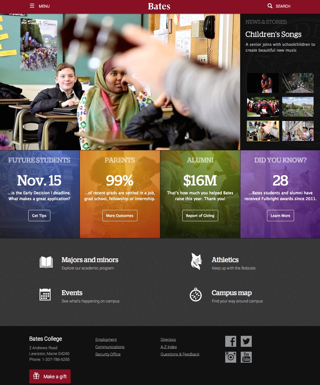
The new site also resolves a variety of challenges the old design had created for users. For one thing, it reduces the number of links in the menu from 135 to 30 in order to serve as a more readily navigable portal for all users. It also expands the capacity for us to communicate directly with key audiences on the homepage — something we were unable to do effectively with the previous full-page image layout that left room for nothing but stories.The old site was striking, to be sure, but feedback and data showed us that it did not serve users well as an entry point.
As with any big web change, we’ve heard a range of feedback. Some very positive reactions from alumni and other public users, a small handful of less enthusiastic initial responses from campus users. Despite a focused internal strategy to communicate about the project, some campus users have been accustomed to finding content through certain pathways, and those paths have now changed. Wherever we can, we work with them to make the path to their content more intuitive. In other cases, I’m optimistic the new pathways will make sense and become habit after a short transition period. Regardless, we respond to all inquiries and record the input as we consider future improvements.
The first public review of the site was published today. It’s a thoughtful and largely positive analysis that puts these changes in the context of the site’s evolution over the past six years. Here are some highlights:
Most of us love beautiful websites with huge images, but they tend to load slowly, and that real estate could probably be used for better things–like enrolling students.
Bates seems to agree. They made a move to large images in 2012 but scaled back in 2014.
Most college and universities are just now making the move to large images, and they should be asking, “What does Bates know that we don’t?” (This. They know this.)
Never sacrifice design for function when it comes to your primary business asset.
…
Bates gets it: parents pay the tuition, and parents want to know how your institution (at least institutions as expensive as Bates) are going to help their children succeed after graduation. At this point, every enrollment marketer working with 17- to 19-year-olds should know that parents matter nearly as much as students.
…
Bates definitely doesn’t have all the answers. They’re clearly listening to their audience, but they’re still finding new tools and conducting new experiments, and they’re still making mistakes (like everyone).
What Bates seems to strive to do is to give website visitors the information they need and the experience they expect. And that is something to emulate.
The greatest challenge for a college website, I think, is making it work well for the incredibly wide array of audiences it serves and their spectacularly diverse needs and goals. In the end, it can’t be all things to all users.
For this latest project, we’ve focused on our public, off-campus audiences. They are by far the vast majority of our users, and above all else bates.edu must serve them. But next on the docket is a new site — The Quad (you can see an initial, bare bones effort here) — focused entirely on the highly targeted needs of our internal audiences of current students, faculty, and staff. Lots of good work still left to do.