 We’ve all seen it by now: the ubiquitous three-lined icon known as “the hamburger” (or, to a jocular few, “Mr. Liney“). Increasingly, we are all coming to know what it means, too: click for menu.
Usability studies continue to show that the hamburger image has still not crossed the familiarity tipping point, however. So gurus in the field wisely recommend that the word “menu” accompany the icon whenever and wherever possible.
Some of these gurus go a step further. Since menus are so critical not only for navigation, but also for orientation, signifying important information about a site to users, they oppose any convention that conceals them. To this way of thinking, the hamburger is a symbol of lazy design, of letting a desire for cleanliness trump usability.
And when sites start taking this once-mobile convention and applying it to desktop? Watch out.
Users have plenty of new things to learn without adding contrived navigation patterns into the mix.
Yep, they hate it.
This week I had the opportunity to take four excellent courses at Nielsen Norman Group’s Usability Week DC. I really respect their work and turn to it all the time. Guess what? They’re not keen on the desktop hamburger, either.
Look for ardent champions of this menu treatment and you’ll have more trouble (though I did find a few cautiously articulate defenses of the responsibly-deployed desktop hamburger). But the naysayer chorus is by far the loudest.
And yet, seemingly every day, another major desktop site is unveiling some version of the hamburger. The New York Times. Huge. Squarespace. TIME. Uber.
What can we make of this? Is the desktop hamburger just a flash-in-the-pan (so to speak), favored by short-sighted designers trying to be hip and avoid tackling the tough IA questions all our sites face? Or is it an elegant and increasingly understood tool that is here to stay?
Are its detractors the noble protectors of usability? Or are they having a knee-jerk reaction to a natural web evolution — the digital equivalent of grammarians getting up in arms when the OED names “selfie” Word of the Year?
I think it’s the latter.
Don’t get me wrong: I am not an advocate for slapping the desktop hamburger on every site. But I absolutely believe it has its place. And I think it is here to stay.
Why am I so sure? Because late last year we rolled the dice with it on bates.edu. And it has gone very well.
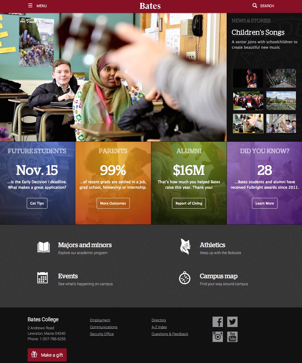 When I say we rolled the dice, I should clarify: we were remodeling the site to make it responsive, and the hamburger was one of several options we considered. We tested it with over forty current students through hallway and one-on-one tests, and with about a dozen alumni in hour-long sessions. At the same time, we overhauled our global nav, a major political undertaking that brought the menu from 135 links down to 30.
Other factors that influenced our decision:
- Every page of the site other than the homepage has a local navigation which is not collapsed, and which is typically more relevant to a user on that page than the global nav
- Most people (72%) enter our site on a deeper page, and so will benefit from the prominence for that local nav (which is made more prominent by not having to compete with the global)
- On the homepage, we added new, prominent elements that link to topical content and act as signifiers to users about what type of site they are on
- The primary audience for our site is teenagers, a population we found through testing to be more familiar with this convention
- Using a drawer for the global menu allowed us to showcase our 30 links in a manner that better suits our IA, without being overwhelming to users
So, what have we found?
In the three months following the remodeled site launch, user engagement with links in the global menu from the homepage has more than doubled compared to the same period one year prior (see the previous site design for comparison). The percentage of unique homepage pageviews that led to clicks in the global menu increased by a magnitude of 2.08, from 15.9% to 33%. Site-wide, the magnitude of growth was 1.7.
I am happy with these results. They map onto our goals. But I don’t want to oversell them. I have no doubt some users have scratched their heads upon landing on our site. But many others have not, and have in fact engaged with us more than they did a year ago. I have no reason to think these outcomes are extensible, either, and I don’t believe the desktop hamburger is a good fit for every site, or even most.
But it’s also not universally bad. It’s not the devil. When the desktop hamburger is deployed thoughtfully and appropriately, it can enhance the UX. Of course we are going to keep an eye on it, continue to test it and solicit feedback, and adapt as quickly and intelligently as we can.
Wondering whether the hamburger could be a good fit for your desktop site? Here are a few questions to consider:
- Am I doing this to avoid making hard decisions about my IA? No? Continue…
- Does my site contain enough signifiers to help new visitors situate themselves without having the global menu front and center? Yes? Carry on…
- How familiar are my site’s audiences likely to be with this convention for housing a menu? Think they might recognize it? Test it out.
This isn’t a trend we should all run out and adopt tomorrow. But I don’t believe it is going away. And done right, I know it can work well.
Well written article, thank you. I especially like the three-step “is this right for me” process at the end. I will say, however, that I somewhat disagree with you that detractors are knee-jerking reactionaries. I think the icon in question has some valid uses, but I do think it’s widely overused and in many cases for the wrong reasons. Too many designers give it no thought and just slap this icon on because that’s what everyone else is doing.
Sure, the icon is becoming more ubiquitous every day. But research tells us [reference needed] that representative/iconic icons (such as the envelope in the footer of this site) can be mentally interpreted much quicker than symbolic icons (like the hamburger) — making the former the better choice for ease of use and user-experience in general. So maybe what we really need is for someone to invent a better menu icon.