 I was very sorry to learn that legendary font designer Adrian Frutiger passed away on September 10.
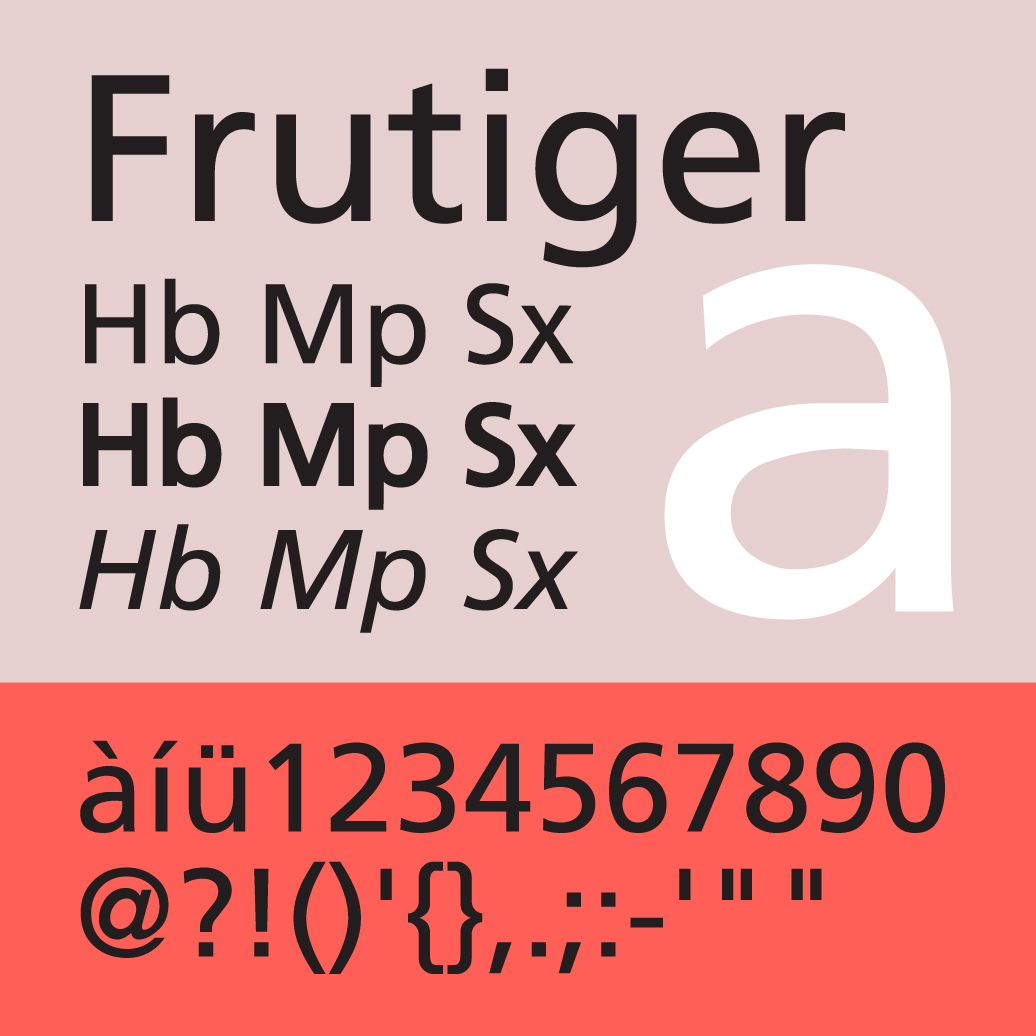
After a somewhat painstaking process of research and testing, last month we finally switched to his “Neue Frutiger” as our sans serif font on bates.edu. The response has been very positive, and I love seeing it there every morning.
I learned only a little about its creator in the process. I knew, for instance, that he was prolific — that his fonts appear at airports, on street signs, and in public places around the world, and are recognized as some of the most readable fonts ever created.
I learned more from his obituary. Things such as:
- He designed OCR-B, the machine- and human-readable font that appears at the bottom of our checks
- He was the son of a weaver
- He lost his first wife in childbirth, and two daughters to suicide
- He and his second wife subsequently created a foundation to support mental health research
A quote called out in the piece captures quite nicely what I think I’ve grown to love about Neue Frutiger, and why I believe it is so successful on our website (and increasingly in our print materials). It’s also just a fun quote:
“The whole point with type is for you not to be aware it is there,” he said. … “If you remember the shape of a spoon with which you just ate some soup, then the spoon had a poor shape.”
RIP Adrian Frutiger, 1928-2015.